Thursday, 25 September 2014

Writing to a Current Practitioner

I decided that i was going to contact a current practitioner to ask about there own work, on how they created it or what techniques they used. I chose  to focus on Ted Carpenter's work, as i came across his work in a gig poster book. I then looked him up, finding his website with all his work and contact information.


I sent him an Email asking him a few questions about his work.


Tuesday, 16 September 2014

Aspect to Aspect


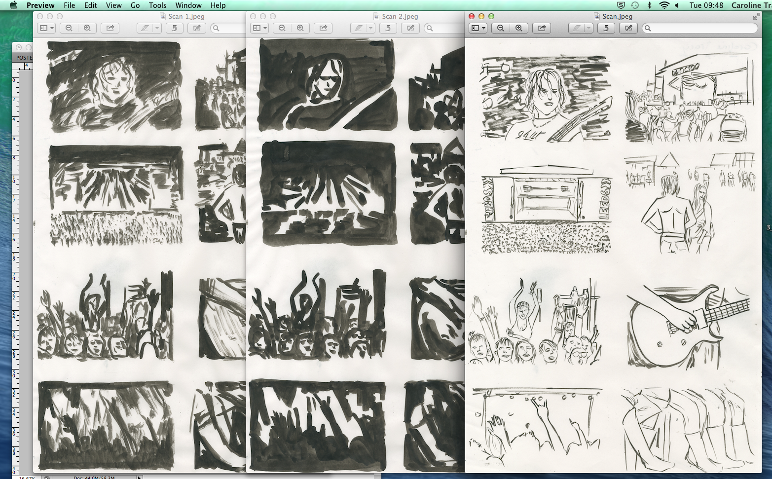
In this technique i decided i was going to focus on festival images to base my work on as i plan to create my own festival poster. I collected 8 key pictures which i associate with a festival and placed them onto 2 A4 sheets on photoshop which i then printed off in black and white.


Then i collected 3 A3 sheets of thin paper so i could trace different tones of the images. The first one i created was the main outlines of the image, using a pot of ink and a thin paint brush i placed it onto a Lightbox and created my first sheet.


I then did the same technique to the other sheets, adding more tone so that i could layer then up nicely later in the process.


I then used an A3 scanner to scan my drawings onto a computer to edit them on photoshop. I first went to 'image', 'adjustments' and then changed the threshold to make sure it was just black and white with a crisp edge. I then used the 'magic wand' tool to select and then remove the white from the drawings, so i was left with just the black.


I did this to all my layers. After removing the white, i could then drag the separate drawings into one file, placing them onto of each other.


Once i had finished moving them into one file, i could then alter the separate layers colour. I did this by clicking on the thumbnail of the layer whilst holding 'command' so it would select the whole layer. I then pressed 'shift + backspace' to get to the colour fill option to alter the colour to what i wanted. I  changing the different layers to different colours a multiple of times seeing which would work best, whilst seeing the correct order the layers should take (the darkest tones at the back and then the outline in the front)


 I decided to chose pink and blue as my colour scheme as i think the colours worked well together. I also decided to alter the values of the image to give it more depth.


Here are 2 of the images i created.


Saturday, 13 September 2014

Poster Emulation

For my emulation i created a brief for me to work to, creating my own bands and artists to play at my own festival.


 I first started by creating a draft with a pencil of where my text would be placed on the page, using rough guides drawn by myself.


Then i started to draw out the draft into my sketch book using a pencil again but adding in more defined text, similar to the one used on the poster i copied.


 Here is my final drafting version. I decided to add in a more detailed element into the poster on the guitar, influenced from my research on the Art Nouveau movement where floral elements were becoming more prominent in specific works. I thought that this gave my poster a more intricate and individual look.

 I then began to use a fine liner pen to trace out my design from my final draft. I also used an a A4 light box to help see my draft.


Here is the completed drawn version of my poster in comparison to my final draft. Once i had finished the traced version, i then scanned it into the computer so i could begin to edit it on Photoshop.

The original is in the background which i then edited on phottoshop. By going onto 'image', 'adjustments' and then threshold which i changed to the dtrangth i thought would be best suited for my magazine. This allowed my poster to be wither black or white.


By keeping it to black and white it allowed me to go to the 'magic wand' tool to elect the white areas of my poster. I then pressed 'backspace' on my keyboard to then remove the white form my poster only leaving the lack outlines behind for me to work with.


I then began to add colour into my poster choosing to go with a blue monochromatic colour scheme to keep it similar to my own copy of the other poster. I kept the 'summer of love music festival' poster up so that could closely link my own emulation to it.


Here is my final emulation.


Friday, 12 September 2014

Copy of 1996 Festival Poster


Here is the original poster i am going to be doing a copy of, from 1969 advertising the 'Summer Of Love Festival'.


I first collected an A3 sheet of paper to do my copy of the poster, drawing free hand with a pencil.


When I had finished doing the outline with a pencil, i then folded my sheet of paper over so that i could create another outline using a fine liner pen, with a light box placed behind it. This would allow me to create a precise replica of my own drawing, with precise and sharp edges.


I then scanned in the outlined copy into the computer onto photoshop so that i could start to alter the image.


I first changed the threshold of the image so i could easily place colour into specific areas, going to 'image' then 'adjustments' and then onto 'threshold' to alter it.


After changing the threshold so there was only black or white i clicked onto the 'magic wand' tool, changing the options so 'Contiguous' was selected. This allowed me to individually select areas to fill with colour without it altering the rest of my images colour.

I then used the shortcut 'shift + backspace' to go onto the 'colour fill' option. I then brought the image of the original up to compare my own colour choices and tried to replicate them as best i could.


I then completed the copy of the poster which you can see on the left. The original is to the right of my own copy.

                                         Copy                                                                Original