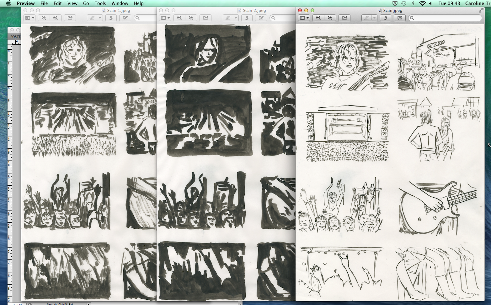
I then used an A3 scanner to scan my drawings onto a computer to edit them on photoshop. I first went to 'image', 'adjustments' and then changed the threshold to make sure it was just black and white with a crisp edge. I then used the 'magic wand' tool to select and then remove the white from the drawings, so i was left with just the black.
I did this to all my layers. After removing the white, i could then drag the separate drawings into one file, placing them onto of each other.
Once i had finished moving them into one file, i could then alter the separate layers colour. I did this by clicking on the thumbnail of the layer whilst holding 'command' so it would select the whole layer. I then pressed 'shift + backspace' to get to the colour fill option to alter the colour to what i wanted. I changing the different layers to different colours a multiple of times seeing which would work best, whilst seeing the correct order the layers should take (the darkest tones at the back and then the outline in the front)
Here are 2 of the images i created.


No comments:
Post a Comment