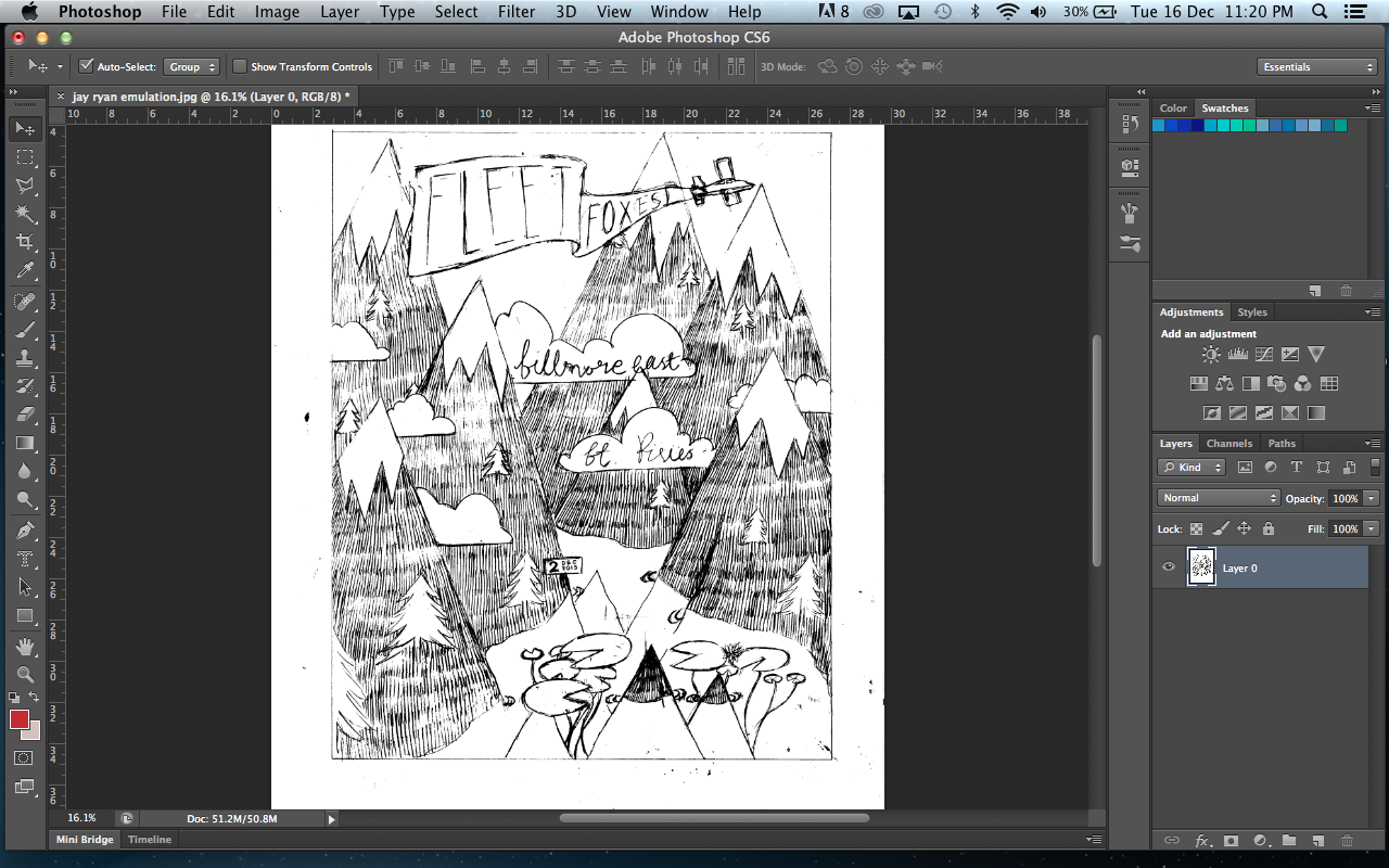
I started to draw out my draft with an HB pencil on card. When drawing it out I altered some parts from the draft as i thought the layout didn't work as well as it could of. I placed a plane and banner instead of just a banner (which joined the two mountains) as i thought it was too similar to a previous designer. Also it helped introduce more contrast into the piece.
I decided that I was also going to add text into the peice by incorporating clouds into the design. To create a contrast with the main typeface i chose on the banner (sans serif front with a thin weight), i trialed a serifed font in the clouds, with a similar weight.
Here is a comparison between the two before i added the last touches to my own emulation.
I then did the same process I did for the copy and scanned it into photoshop, changing the levels and then going onto 'image', 'adjustments' and 'threshold' to get a harsh colour difference so I could easily remove the white with the magic wand tool.

I added colour gradually into the piece.
I then altered the hue of some colours to get a better scheme, portraying the band well.
After altering and selecting a colour scheme, I used it within my final piece.
I decided when adding in the colours that there wasn't enough contrast in the piece, making it look too monochromatic for what I wanted. I changed the colouring of the sign and flag so that it would be able to stand out from the page, with a contrasting orange. This change helped turn the piece into a subtle contrasting colour scheme.
Also I decided to add tone into the mountains, adding more depth into the piece, using the faded paint brush tool with a darker version of the mountain colour.
Using the lasso tool I then selected some of the clouds and using 'cmd'+'c' to copy the image and then 'cmd'+'v' to paste them. I removed the text and then added them into the sky as I thought it looked too bare.
When i had completed my own colour scheme, it was time to try and change it into a 3 colour schemed piece, so i could create 3 coloured print. I first separated the white from the piece as i wouldn't need it because the white would be represented from the paper in the background.
Then to help me get the fading colour within the mountains i used the 'colour Halftone' option.
After altering the colour scheme I had limited the choices down to 3 layers.
I then used the threshold option to make the colours black on all my layers so i could print them off easily.
Here are the 3 different layers.
I then decided to trial out what it would look like if all my layers were combined under one colour.
I then experimented with all the layers being an orange colour, which worked well but I still wanted to create my screen print.


