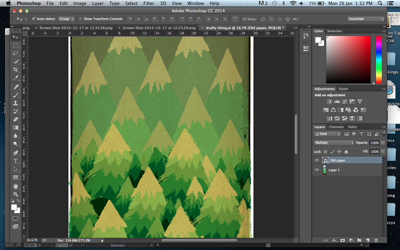
During my drafting process i created some designs i wanted to try out. I decided i was going to use Illustrator to complete it, being influenced by a piece of Cricket Press's work, and its final style.
I first took the draft, scanning it onto my computer, and placed it into an illustrator document to base my design. I then used the pen tool to draw the outline of my design.
After completing the outline I drew out different strokes using some ink on paper, which I then scanned in to create art brushes. This would then allow for me to use them as an outline for the shapes, to create a rougher exterior which would suit the style of the Fleet Foxes.
I used the 'Image Trace' tool to turn the stokes into a threshold I thought worked well for what I wanted to use them for.
I then selected each individual stroke and straightened them on the page so they were flat. I then began to individually select the stroke and click on the brushes option on the right hand side of the page.
I would then click on the 'new brush' option to begin casting my own strokes, selecting the art brush option.
Then to allow a colour change of the brush when I used it, I selected the tints method in the colourisation section. I did this with a wide variety of stokes to give me a good selection of edges to use.
I then began to add colour into the pieces, selecting a limited colour scheme to use keeping it simplistic.
When I had begun to finish adding in colour, I decided to use the gradient tool for the background colour to help it look more developed and varied. I also tried the technique out on the banners to indicate the changing of its positioning on the page. After trailing this out however, decided to remove it from the banners as it looked to out of place.
I then decided to develop this idea further by expanding the piece slightly outwards and then upwards. I changed the canvas size to allow the changes to occur uninterrupted.
Then after further drafting I began to add mountains into the background, adding in a pink circle in the far distance to represent the sun.
To help make the transition smoother I changed the tones of the mountains to finally arrive at the colour of the mountains I wanted.
Then developing it further, I placed a old paper background into illustrator to help give my poster a texture, similar to the feel the Fleet Foxes music gives off (rough). I then began to alter the colour schemes, trailing what other colours would be like.

To complete the poster I added in some text with type i drew myself. I did this by placing them into photoshop, changing the threshold and then editing certain parts to 'neaten' them up.
I then began to place it onto my work, changing the weight and size of the type.
I was dissatisfied by the font i had select so thought that an additional script type would work well on the pice, helping convey the rough but modern style of music they have. I went through the same process to get the type onto photoshop and edited to be placed onto my illustrator work. I drafted out layout ideas to help make my selection process easier.
Here is when I began to replace the older text with my new type design.
Here is my Final version.


No comments:
Post a Comment